KitchenAid — Color of the Year 2021
A landing page campaign for Brazil's first participation in KitchenAid's global Color of the Year launch — introducing the Artisan Stand Mixer in Honey.
![[ Hero — case study cover ]](/images/kitchenaid/kitchenaid-05.webp)
Overview

For the first time, Brazil is participating in KitchenAid's global Color of the Year launch campaign, introducing the newest Artisan Stand Mixer in Honey. While the brand is already associated with colour, the Color of the Year launch has not yet achieved widespread recognition in the national market.
Challenge
Driver. Colour is an important factor for small appliance shoppers, as they seek to match their existing decor and personal tastes.
Barrier. Without knowing the tangible benefits that a particular colour can offer, they prioritise the functional details of products, seeing colour as a secondary consideration compared to the main purchasing factor.
Process
It was possible to adopt the design thinking framework in order to better understand the needs and opportunities for the project.
The Process, Step by Step
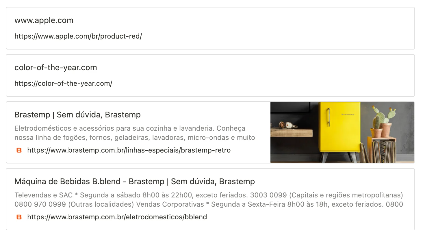
Desk research — Benchmarking
References from landing pages and special sites that leaned heavily on colour as their argument.
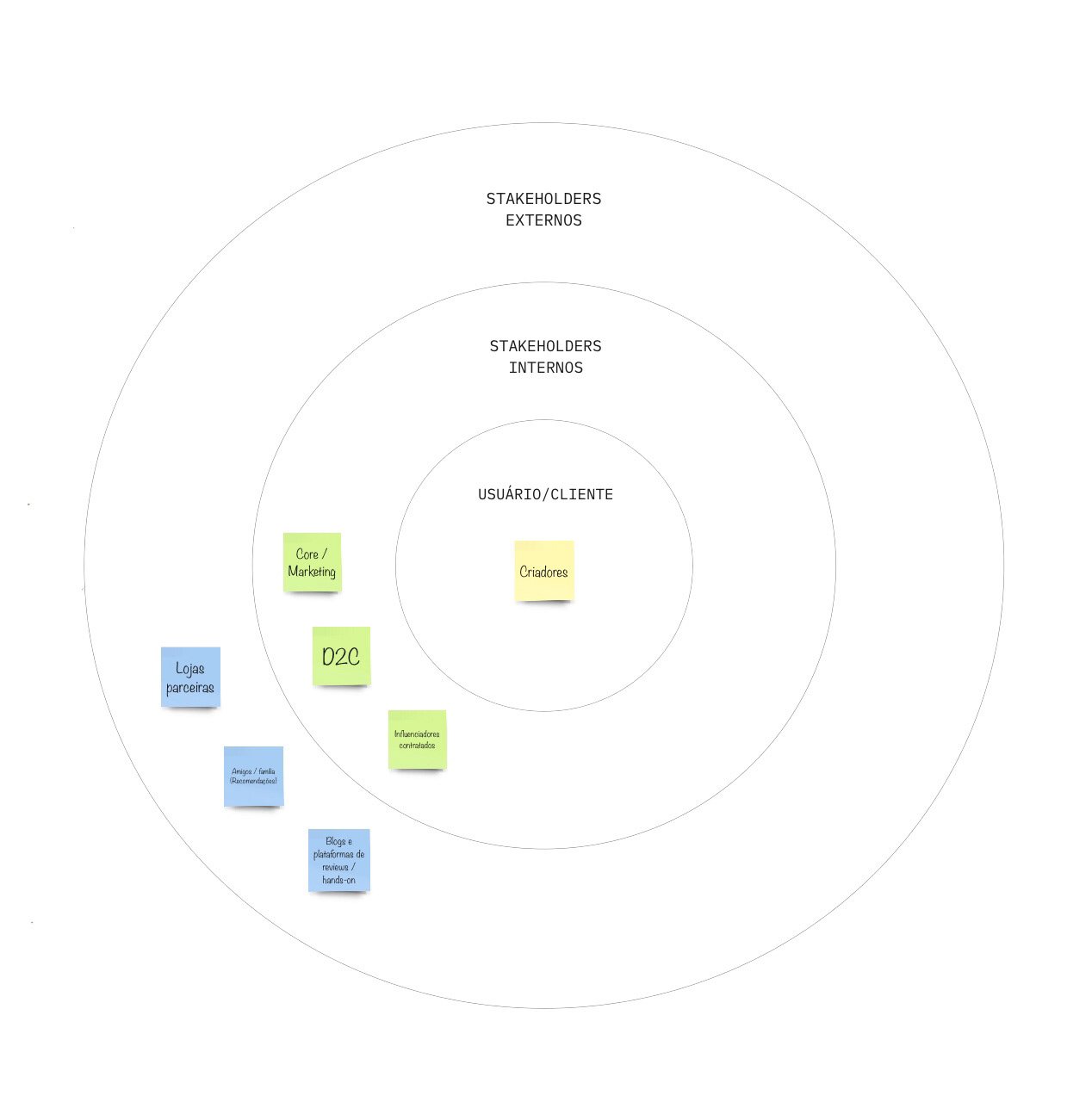
Stakeholders map
Mapping who the campaign had to answer to — the user and customer at the centre, internal teams around them, and the external partners and channels beyond.
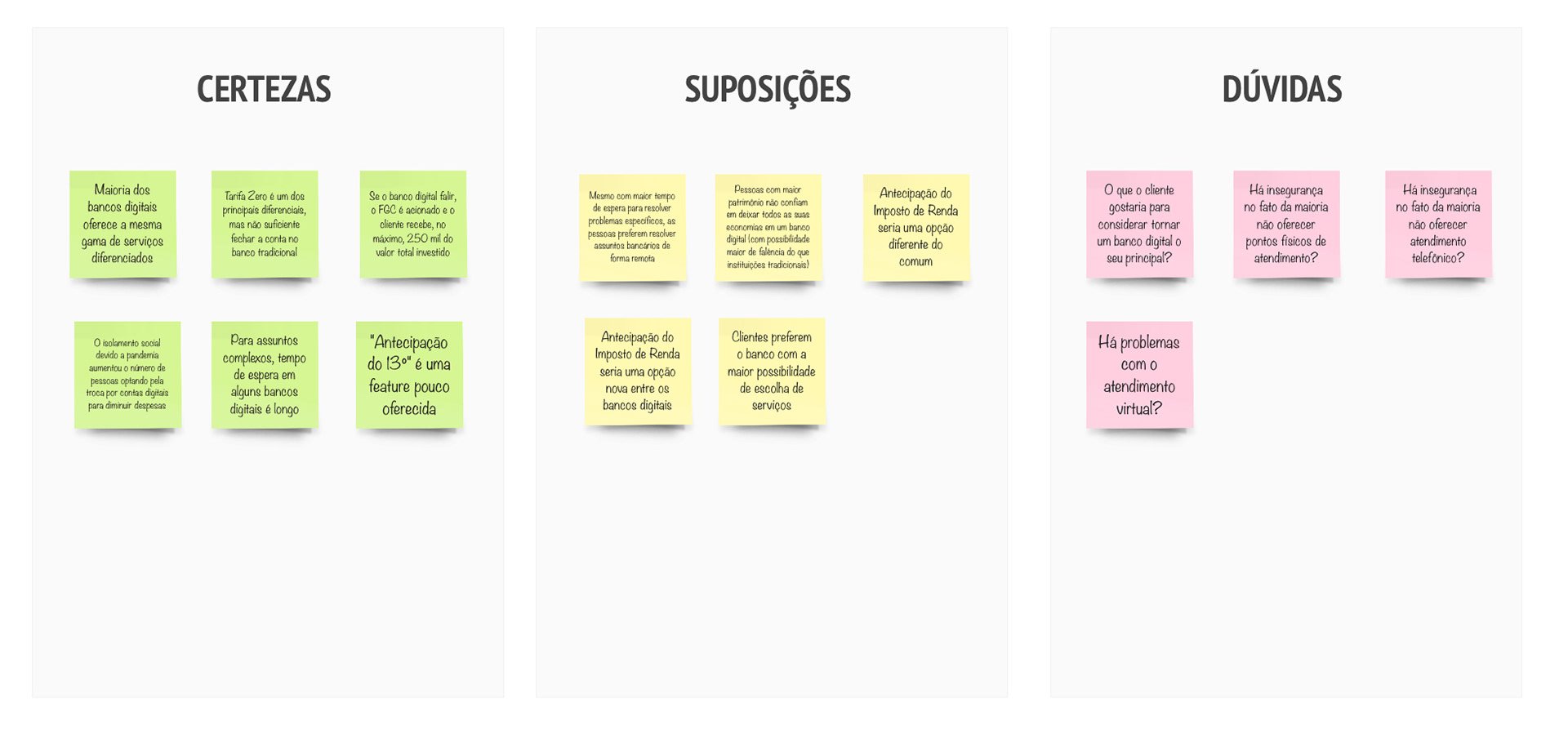
CSD Matrix
Building on the desk research and benchmarking, a CSD Matrix was created to surface certainties, suppositions and doubts, and so give the research a clearer direction.
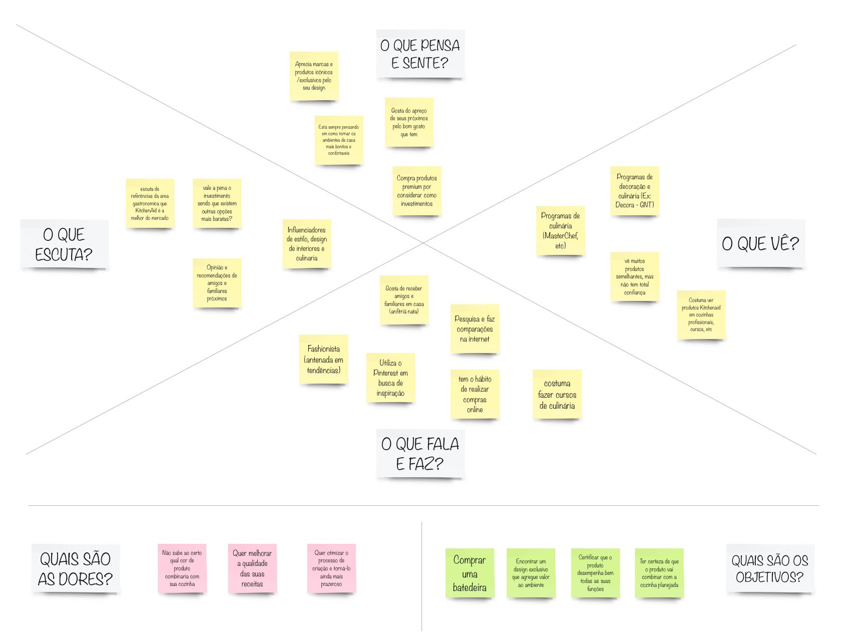
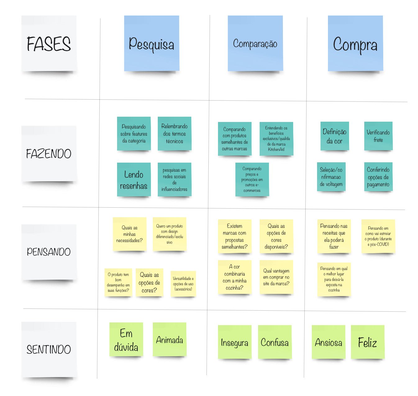
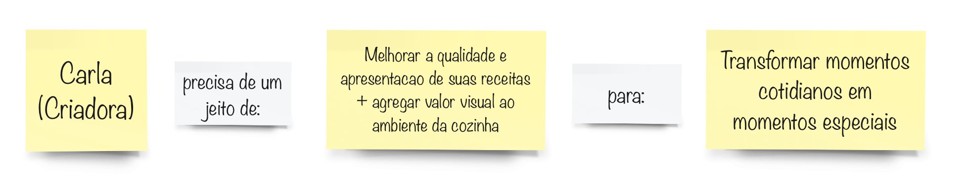
Persona, Empathy Map, User Journey and Need Statement
- They follow trends and influencers
- They use Pinterest
- They enjoy hosting friends and family
- They take courses and follow cooking programmes
Hypothesis
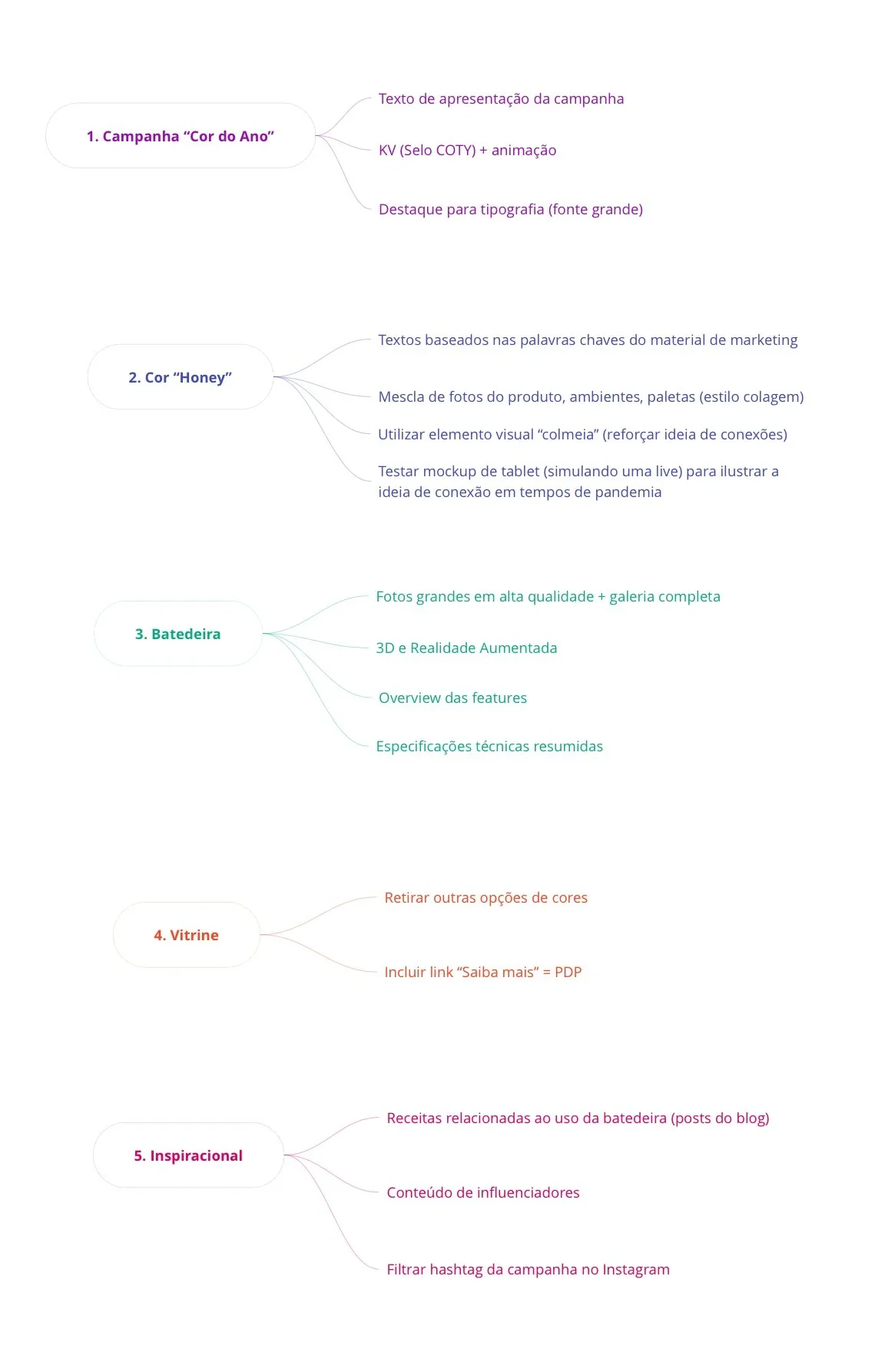
With the research results and the users' need statements in hand, we moved on to framing hypotheses more decisively.
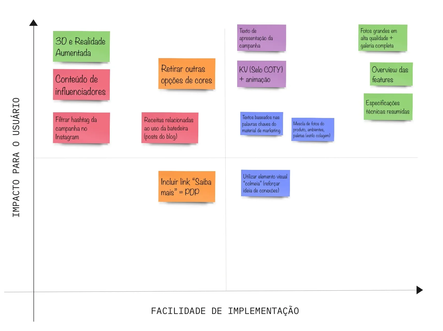
Prioritization matrix
A prioritization matrix let us weigh the listed hypotheses by ease of implementation against impact on end users.
Wireframes
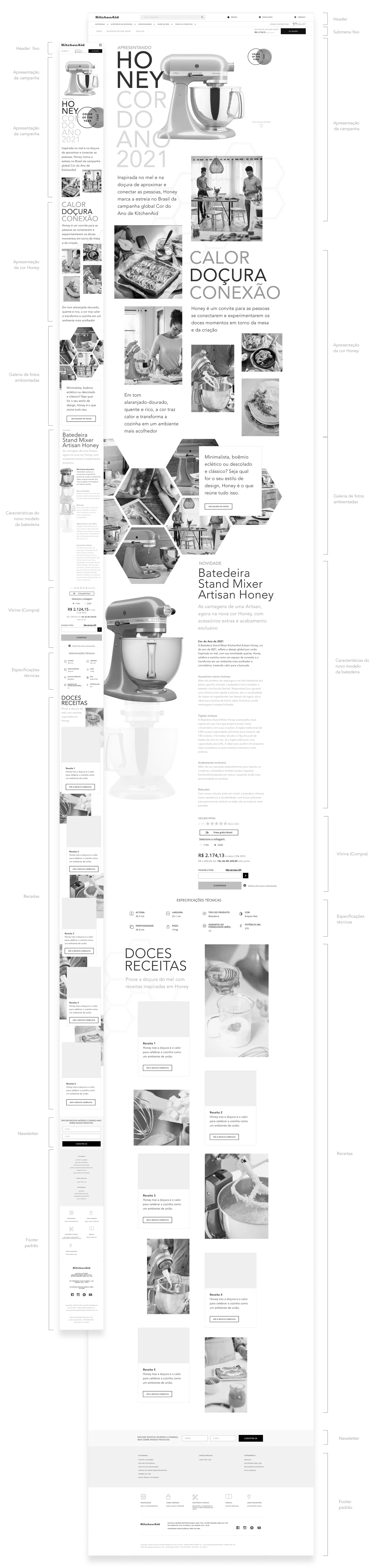
Flows and screens took shape as wireframes before moving on to the final layout.
Final solution
The result: the Color of the Year 2021 by KitchenAid landing page.
