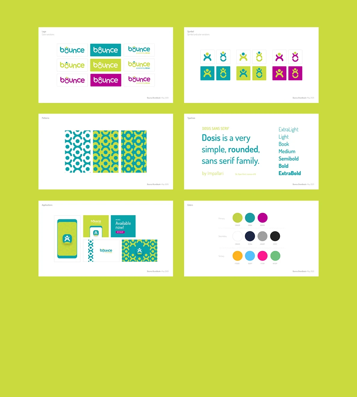
A visual identity system for Bounce — Darisni's daycare management app — designed to carry warmth across the icon grid, the app UI, and every brand touchpoint that connects nurseries with parents.
Role
Brand Designer
Year
2020
Country
Kuwait
01
Overview
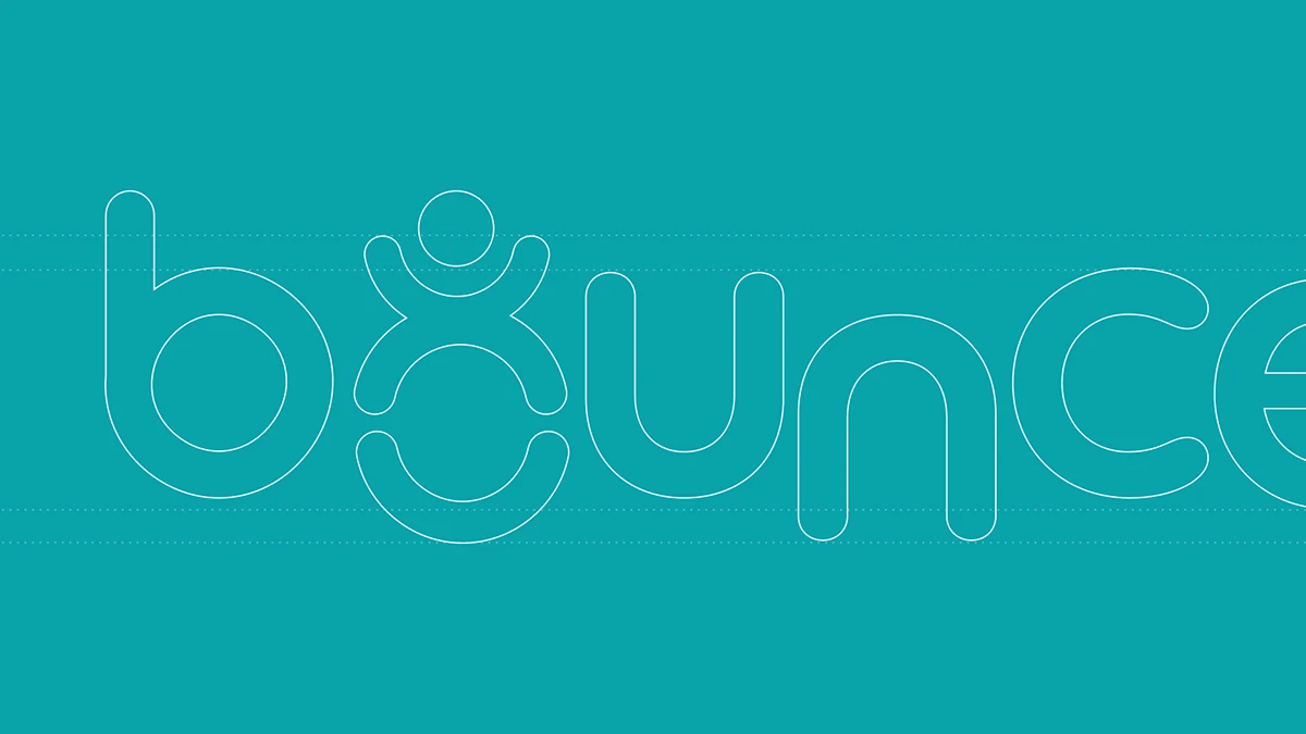
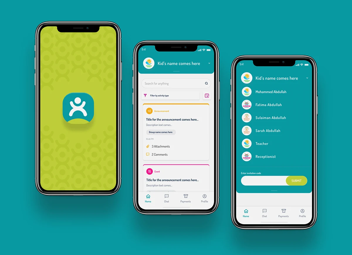
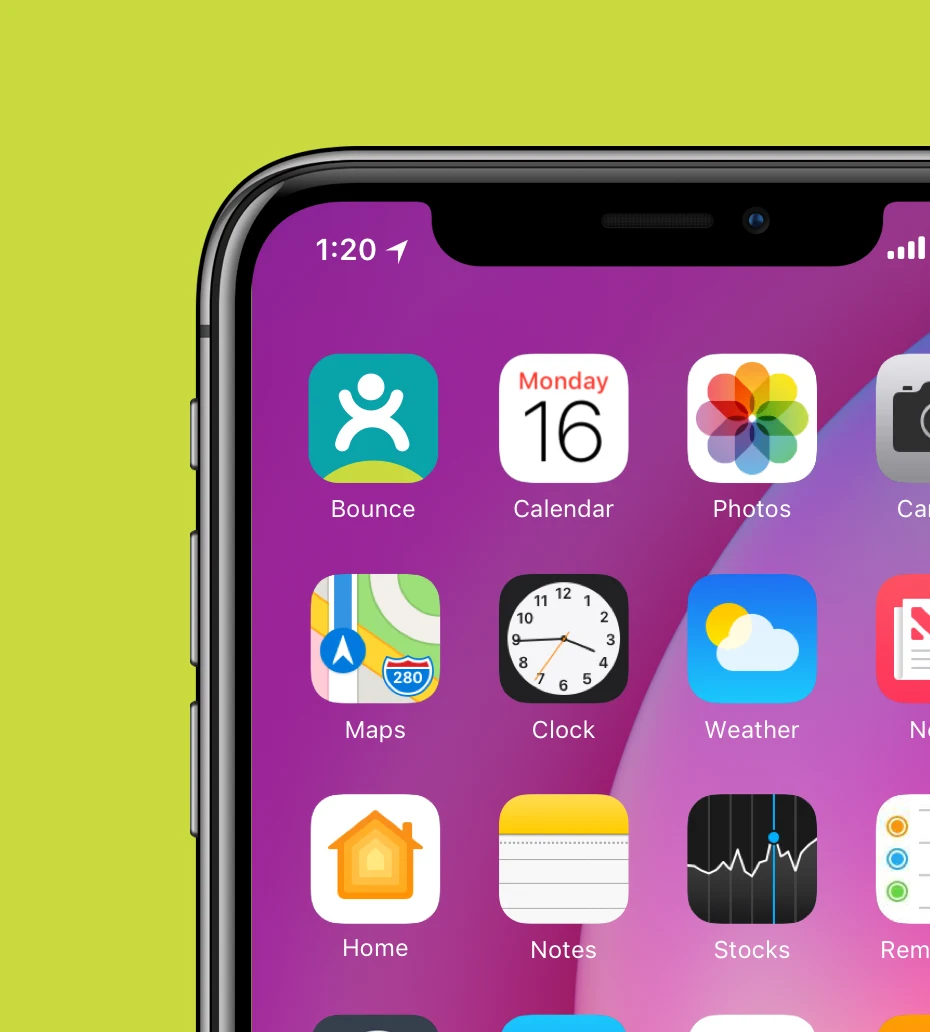
Bounce grew out of Darisni's ecosystem as a dedicated tool for nurseries: a platform where parents follow their children's day through announcements, events, payments, and direct messaging with teachers. The visual identity had to work at every scale — from a 60-pixel icon on a parent's home screen to full-bleed marketing collateral — while staying clearly connected to Darisni's existing brand. The result is an energetic system that borrows the parent brand's confidence and adds its own character: lime, teal, and fuchsia, anchored by a mark that doubles as both a logotype letter and a small jumping figure.
02
Challenge
Designing for children without infantilising the product. The app is used by parents and nursery staff — professional operators who need to trust the platform — but it exists in the world of childhood, play, and care. The colour palette had to be warm and energetic without tipping into noise. The mark itself needed to resolve two things at once: reading as a child-like figure with arms raised while also functioning as a custom letterform inside the word 'bounce'. The identity also had to carry cultural specificity for the Gulf context it was built for, using patterns and visual language that felt regionally rooted rather than generic.
03
Process
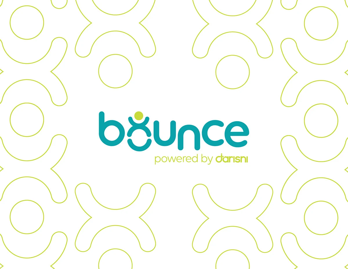
The project started with the mark and worked outward. Once the logotype was locked — with the figure embedded in the 'o' — the colour system followed, establishing three voices: teal as the primary tone, lime as the energetic accent, and fuchsia as the surprise. Pattern language came next, derived directly from the mark's geometry and tiled into a repeating motif that carries across app backgrounds, onboarding screens, and brand collateral.
1
Brief
2
Identity
3
Colour
4
Pattern
5
App
1
Brief
2
Identity
3
Colour
4
Pattern
5
App
04
Outcome
2020
Product brand for Darisni's daycare platform
1
Visual identity system spanning app, icon, and collateral
3
Brand colours — teal, lime, fuchsia — each with full palette depth
![[ Hero — case study cover ]](/images/bounce/devices.webp)