A visual identity built to carry weight — a mark that works at 32px and full-bleed, a colour system that holds across light and dark, and a voice that feels human without drifting into startup noise.
Role
Lead Designer
Year
2024
Team
2 people
Country
Kuwait
01
Overview
Wallo needed a brand with real presence — an identity that held its character as a mobile app icon, a logotype on a dark surface, and a headline on a white page. The project opened with an exploration phase: mood references, directional concepts, and a shared sense of what the brand should feel like before any marks were drawn. The result is a cohesive visual identity system that scales from product UI to brand campaigns without losing its edge.
02
Challenge
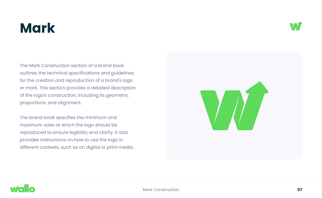
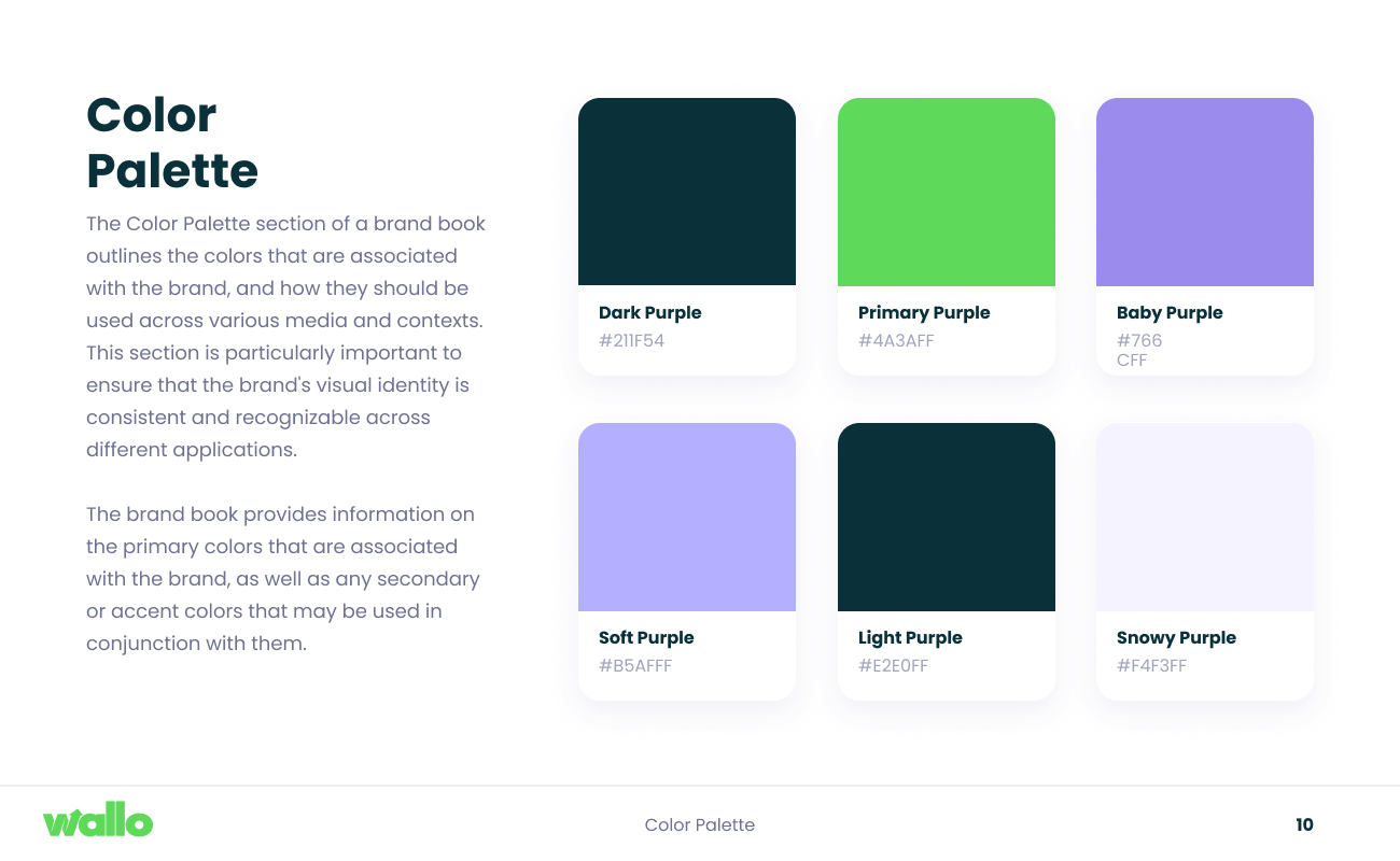
The core tension was flexibility versus distinctiveness. The mark had to be simple enough to read at 32px on a phone screen, but rich enough to anchor a full-bleed brand moment. The colour palette needed to hold vibrancy across both light and dark contexts. And the brand voice had to feel human and confident without sliding into generic startup territory. Every decision was made to serve the full range of surfaces the identity would live on.
![[ Hero — case study cover ]](/images/wallo/mark-cover.png)