Settling a Modern Foundation for Digital Banking in the Middle East
Designing the end-to-end onboarding journey for a leading Saudi retail bank adopting a modern engagement banking platform — localised for the national identity infrastructure, payment network, and regulatory environment of the Saudi market.
![[ Hero — case study cover ]](/images/banking-ksa/cover.jpg)
Overview
A leading retail bank in the Middle East had built its business on deep branch relationships. Customers trusted their local branches for everything — opening accounts, managing transfers, resolving issues in person. But the digital landscape was shifting fast, and the bank's existing tools hadn't kept up: fragmented interfaces, legacy software, and little consistency across touchpoints.
To change this, the bank chose to adopt a modern engagement banking platform — a strategic investment in building a unified, scalable digital experience from the ground up.
As a Senior Product Designer in the Services department — where implementation teams are allocated to client projects, I joined the project focused on the Origination stream — the flows responsible for bringing new customers and products into the bank's digital ecosystem. The Retail stream had been running in parallel with a previous designer. As the team shifted and I became the sole designer across both streams, I absorbed the Retail work at a late stage — inheriting not only Figma files but an established client relationship, and a set of decisions already in motion. Most of the heavy Retail design work had been completed; my role was to take ownership of what remained, bring it to the same standard, and keep both streams moving simultaneously. The role took me to Riyadh three times — on-the-ground time that proved essential for understanding how the bank operated, what their customers expected, and how to make design decisions that landed in a room rather than just in a file. This case focuses on the new client onboarding journey: the most consequential first impression the app could make.


Challenge
Implementation projects carry a specific kind of design tension: you're not designing from a blank canvas. You're working within the constraints of an off-the-shelf platform — its design system, its component library, its opinionated flows — while serving a client with their own brand, regulatory requirements, and users with very specific expectations.
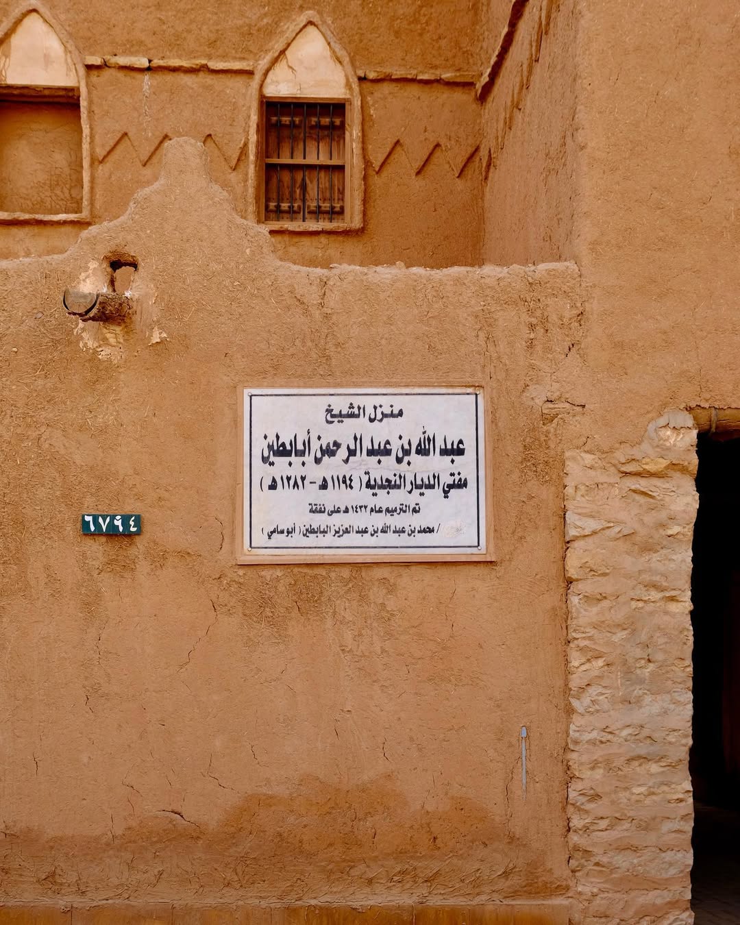
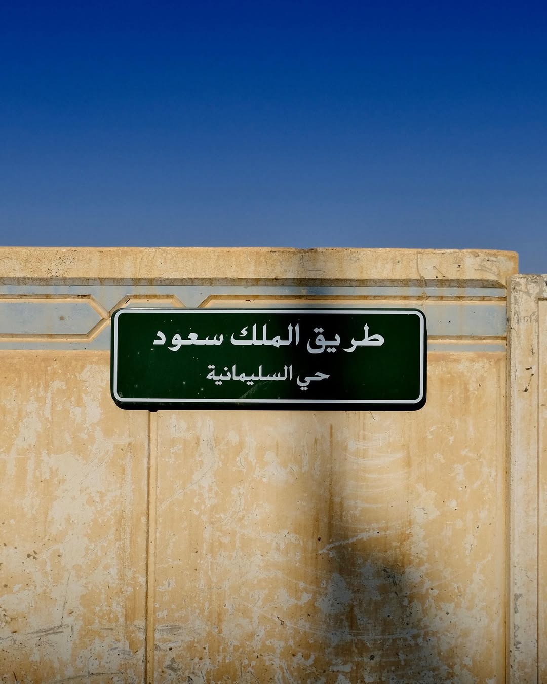
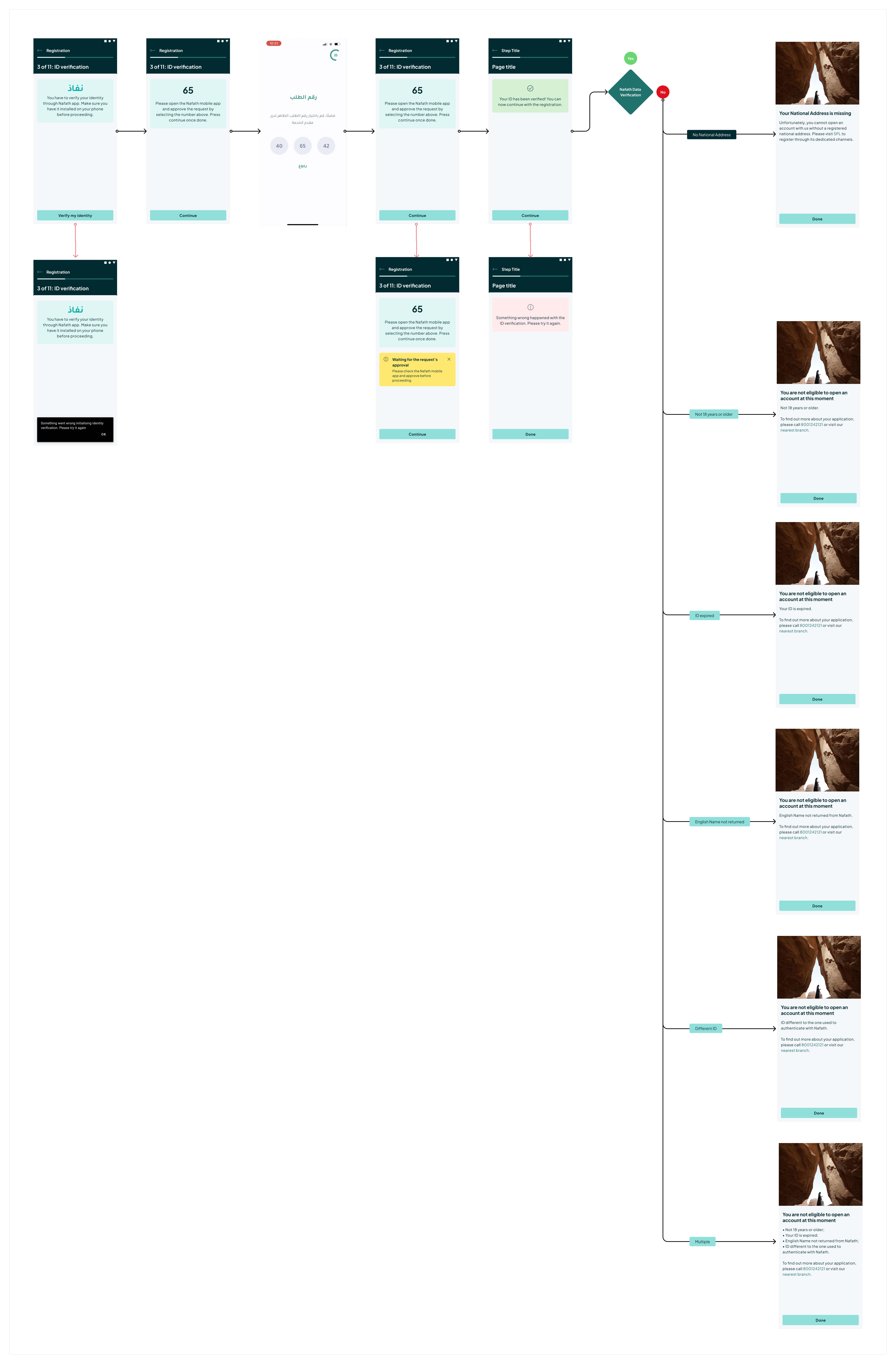
Local identity infrastructure. Account opening in Saudi Arabia runs through Nafath (نفاذ) — the national digital identity system. Rather than a generic KYC flow, the onboarding had to route users through an external government app for biometric verification, then handle a range of eligibility outcomes: valid, no national address, ID expired, age ineligible, orphan ID status, and more. Each of these needed its own designed resolution — not a generic error screen.
Regulatory gating. Account opening is restricted to users physically inside the Kingdom. We designed a geo-detection gate at the very start of the flow — if you're abroad, you can't proceed. Simple in concept; specific in execution.
Local ID formats. Saudi National IDs and Iqama numbers (residency IDs for non-nationals) follow strict formats: 10 digits, starting with 1 or 2 respectively. The platform's default ID input needed to be adapted with localised validation logic and error messaging that explained the format clearly — not just flagged the error.
Mada, not Mastercard. The outcome of onboarding was a virtual Mada card — Saudi Arabia's national payment network. This determined how the completion screen was written, what the card looked like, and how Apple Wallet integration was framed.
A moving design system. Midway through the project, the bank underwent a brand refresh — and with it, a cascading update to the platform's design tokens. This meant actively tracking what had changed, identifying which screens were affected, and absorbing those updates without breaking the consistency of work already in progress. It was a useful reminder that in implementation projects, the ground can shift under you mid-build.
Stakeholder complexity. Three layers of decision-making — the bank's internal product and compliance teams, the platform vendor, and our delivery team — each with different priorities. Aligning them on design decisions required as much communication skill as craft.

Process
My Role
I was involved across the full design scope of the onboarding stream:
UX flows and journey mapping — Mapping all 11 steps of the onboarding journey end-to-end, including every error state, edge case, and eligibility outcome. The full flow board runs wide: entry, identity verification, mobile number confirmation, Nafath biometric check, personal data capture, address confirmation, disclosures, and credential creation, through to account confirmation and card issuance.
UI design within the platform's design system — Designing screens inside the platform's component library, customising where local requirements demanded it. A recurring judgment call: when to extend a component vs. accept the platform default. That decision affects both delivery velocity and design quality.
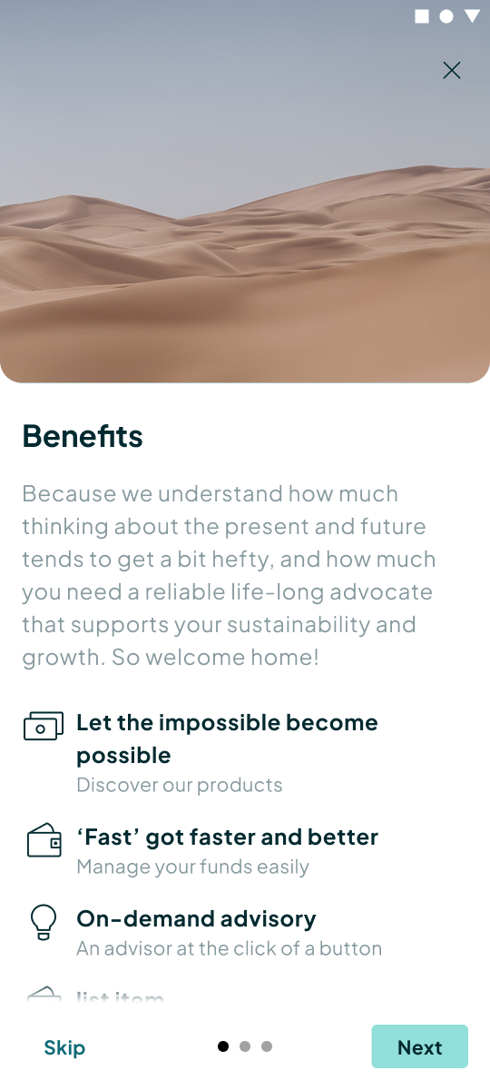
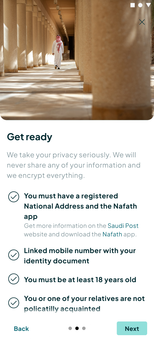
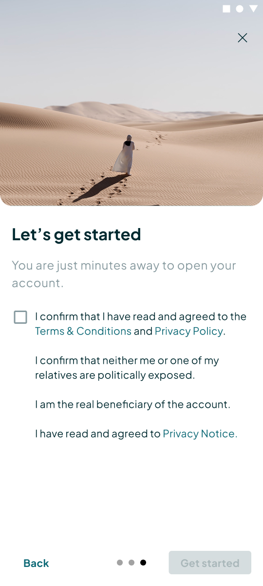
Design system adaptation — Identifying and filling gaps between the platform's out-of-the-box components and local needs: ID field validation patterns, localised error copy, Nafath handoff screens (including Arabic-language system states), and photography direction that felt grounded in the region.
Stakeholder alignment — Running design reviews, presenting decisions with rationale, and translating between business requirements and design intent across teams. In implementation projects, alignment is what keeps delivery moving.
The project ran in iterative sprints with frequent client reviews built into each cycle. Scope evolves in implementation work — the distance between a documented requirement and a screen that actually makes sense is where the real design work happens.
Each sprint cycle roughly followed this rhythm:
1. Understand the requirement — What does the client need this step to do? What does the platform already support? Where's the gap?
2. Map before you mock — Flow documentation came first, especially for high-stakes moments like identity verification where errors have real consequences (and real regulatory implications).
3. Design within constraints — UI work inside the platform's design system, with extensions justified explicitly.
4. Review and align — Client-facing sessions to walk through decisions and document sign-off.
5. Refine and hand off — Annotation and handoff documentation for the development team.
Key Design Decisions
Research in the field: guerrilla testing
At a certain point in the project, the client ran a guerrilla testing session with real users. I supported remotely throughout the preparation — planning the session, defining goals, and shaping the test content — while the client's UX Lead took ownership of the execution on the ground.
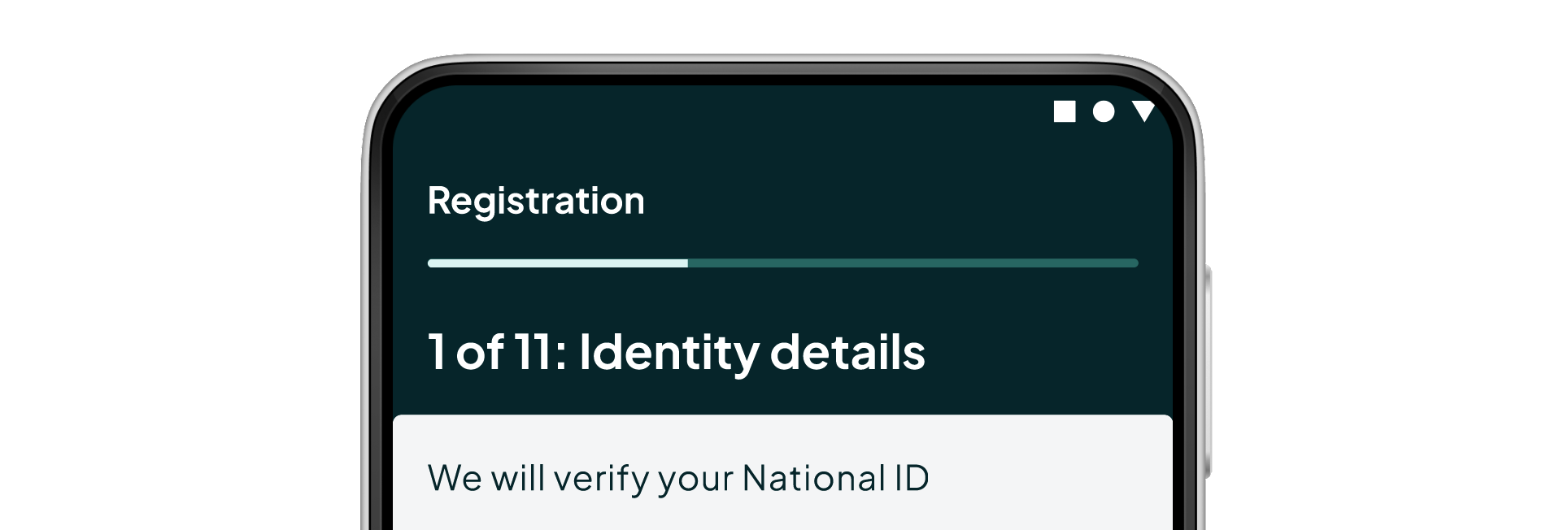
The most significant finding was a usability issue rooted in orientation — specifically, visibility of system status and user control. Users weren't confused by individual steps; they were unsettled by the flow as a whole. Without a visible sense of where they were or how much remained, the process felt open-ended — and that uncertainty made them hesitant to continue. We had a hypothesis going in that a numbered progress indicator would help. The test confirmed it wasn't optional.
The outcome was a concrete design change: every screen in the journey now carries an "X of 11" label in the header — a consistent anchor that gives users a clear sense of progress and how much is left. The placement wasn't arbitrary. Rather than introducing a new standalone progress component, we evaluated the options together and chose to embed the indicator within the existing step title — making use of an out-of-the-shelf component and keeping the implementation lean. It's visible in every screen in this case study. The testing turned an assumption into a decision we could stand behind, and a shared evaluation turned that decision into one that also worked for the system.
Geo-restriction as a first-class experience
The very first conditional in the flow isn't a form — it's a location check. Users outside Saudi Arabia are shown a dedicated screen: a clean, informational blocker with a support number and no dead end. Designing this as a considered experience (rather than a crash or blank state) set the tone for how we approached edge cases throughout the flow.
Identity entry: validating for local formats
Step 1 asks for a National ID or Iqama number — a field that required localisation to handle Saudi-specific rules. The adapted version validates that the number is exactly 10 digits and begins with 1 (Saudi citizen) or 2 (resident). Error messages are specific — "must have 10 digits and should start with 1 or 2" — rather than generic. This specificity matters: users who don't understand why their input failed are more likely to abandon.
Nafath and KYC: verification without the burden
The KYC portion of the flow is necessarily long — but the design principle behind it was to keep the user's active effort to a minimum. Because Nafath returns a verified profile, most of the data across these steps is pre-populated and read-only: the user's role is to review what the system already knows, not to re-enter it. The cognitive load sits with confirming, not with filling in.
What required careful design was the handoff itself. One of the platform's key strengths — and a reason it was chosen for this project — was its ability to integrate with third-party systems. The Nafath connection was a direct expression of that: rather than building a proprietary identity verification flow, the onboarding could leverage existing national infrastructure. The design challenge was making that integration feel seamless to the user. Users are shown a Nafath verification number and directed to open the government app — a context switch that can easily lose people if not handled clearly. The design bridges this with explicit instruction, Arabic-language support for the Nafath UI states, a loading state during approval, and a full set of outcome screens for every eligibility result Nafath can return: verified, address missing, ID expired, age ineligible, orphaned account, disqualified.
Each outcome required its own considered response — a message that respected the user's situation and gave them a clear next step, whether that was continuing the flow or being directed to a branch.
Mobile verification: depth of error handling
Step 2 — verifying a mobile number via OTP — surfaces more states than most designers document. The full set includes: empty field, invalid format, OTP sent, OTP resent, code expired, code incorrect, maximum attempts exceeded, internal server error, and system timeout. Each has a distinct response. This level of coverage wasn't over-engineering — it came directly from experience with what breaks in production and what gets escalated to support teams.
Password creation: progressive validation
The final step — credential creation — was largely delivered out of the box by the platform, and intentionally kept that way. The existing pattern already handled the core well: a live validation checklist that updates as the user types, requirements transitioning from neutral to confirmed as each is met, and specific field-level error messages ("Username already exists," "Username must only be English letters and numbers") rather than generic form-level failures. The experience acknowledges that users make mistakes and guides them out rather than just flagging the failure — and in this case, the platform had already solved it well enough not to warrant customisation.
Completion: Mada card and account summary
The confirmation screen surfaces IBAN, account number, and customer reference — all copyable with a single tap (with a "IBAN copied!" toast). The welcome imagery uses local photography: a man in traditional Saudi dress against an ornate wooden lattice, grounding the moment culturally. A virtual Mada card is issued and can be added to Apple Wallet — scoped for a later phase, but designed and documented.
On Working With a Platform Design System
Part of stepping into an ongoing project is working with whatever foundation exists and improving it as you go. This one required reconciling the local Figma file with more recent platform component releases, absorbing a mid-project brand refresh that cascaded into token updates across screens, and doing all of it without Figma variables — which weren't available at the time. Token management ran through styles and manual overrides, which made consistency a discipline rather than a default. The judgment call underneath all of it stayed constant: when to extend the platform's components, when to accept their defaults, and when to escalate a gap rather than quietly work around it. Holding that consistently across 11 steps and hundreds of states is what keeps an implementation coherent rather than patchworked.
Outcome
What I Learned
Implementation design is a specific discipline. You're not just a designer — you're a translator, a negotiator, and sometimes an advocate for the user inside a vendor relationship where design priorities have to be actively negotiated alongside delivery and commercial considerations.
Absorbing a second stream mid-project — while keeping Origination moving — reinforced something about how implementation design actually works: you spend as much energy understanding existing conditions and maintaining momentum as you do creating new things. The brand token update drove this home: mid-project changes to a live design system mean holding two realities at once. It sharpened my appreciation for token-first thinking — the more consistently you've applied the system, the less painful the update.
Going to Riyadh three times changed how I approached everything else. Seeing the bank's environment, understanding what "trust" looks and feels like in this context — none of that translates through a brief. The collaboration with the client's UX Lead was valuable in a similar way: having a design counterpart on their side who understood both the users and the product made the guerrilla testing possible, and made the findings land. Supporting that session remotely — observing in real time while someone else facilitated — is its own skill, and one that only works when the relationship and shared context are already there.
The Saudi market itself taught me things I couldn't have anticipated. Nafath is a genuinely elegant piece of national infrastructure, and working with it required understanding not just the API contract but the trust users place in government verification systems. Mada is a point of national pride. The photography direction that resonated was distinctly local — not the generic "global banking" stock imagery most platforms default to.
Designing for a market you're not from asks for genuine curiosity. The answers are rarely in the requirements document.
Status
The screens in this case study reflect the Minimum Marketable Product (MMP) as it stood at the time of my contributions. The product has continued to evolve since — the current interface may differ from what's shown here.