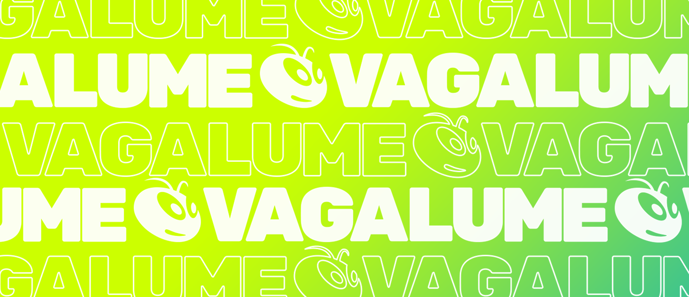
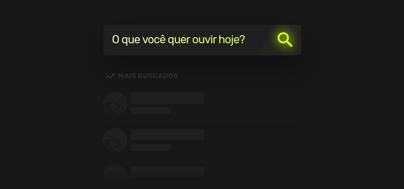
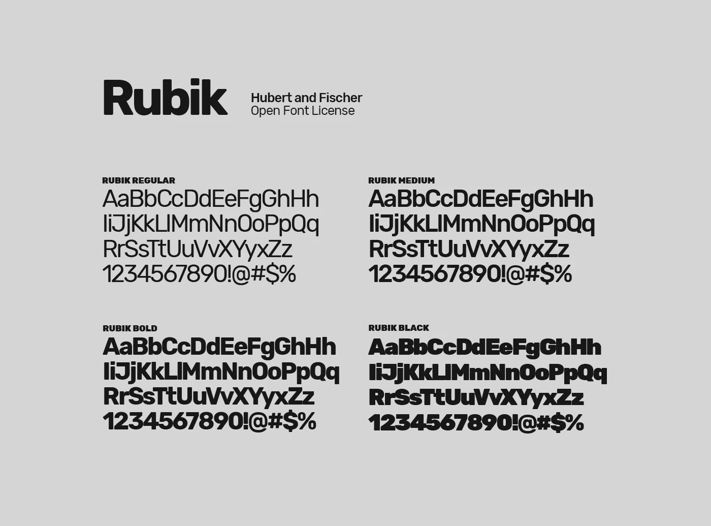
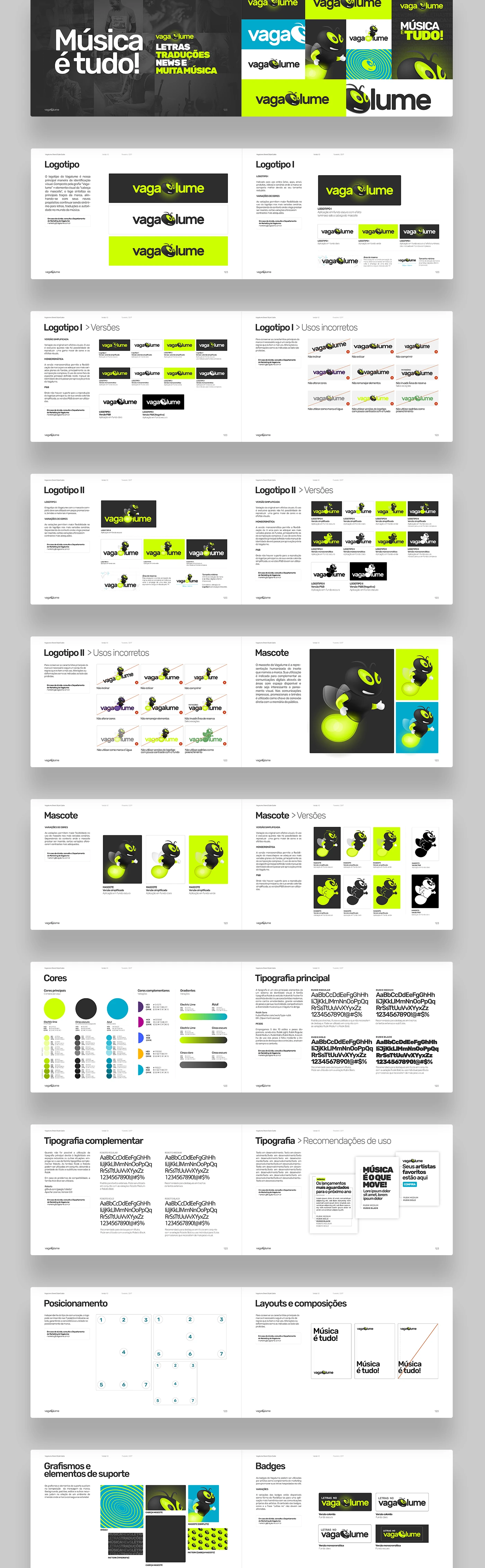
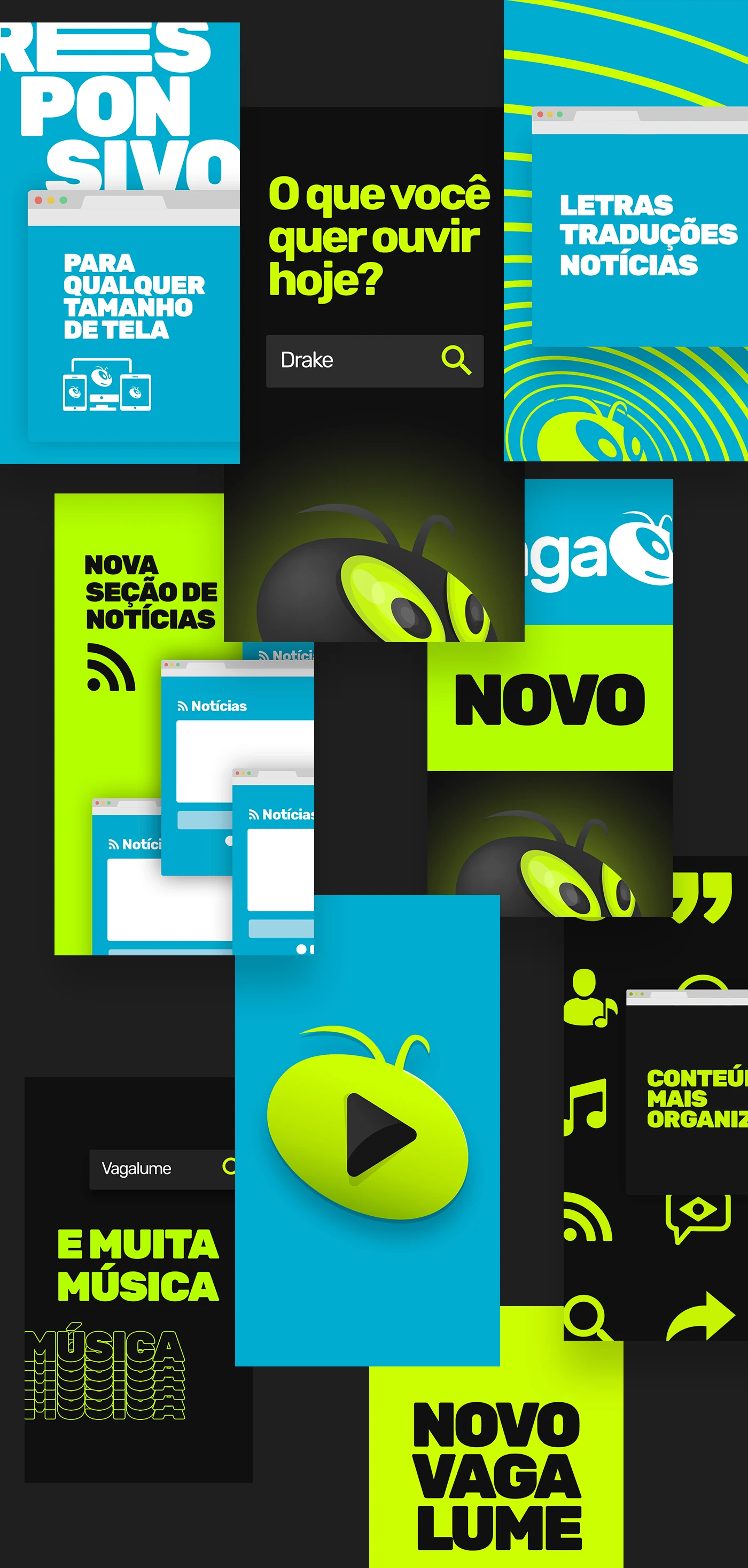
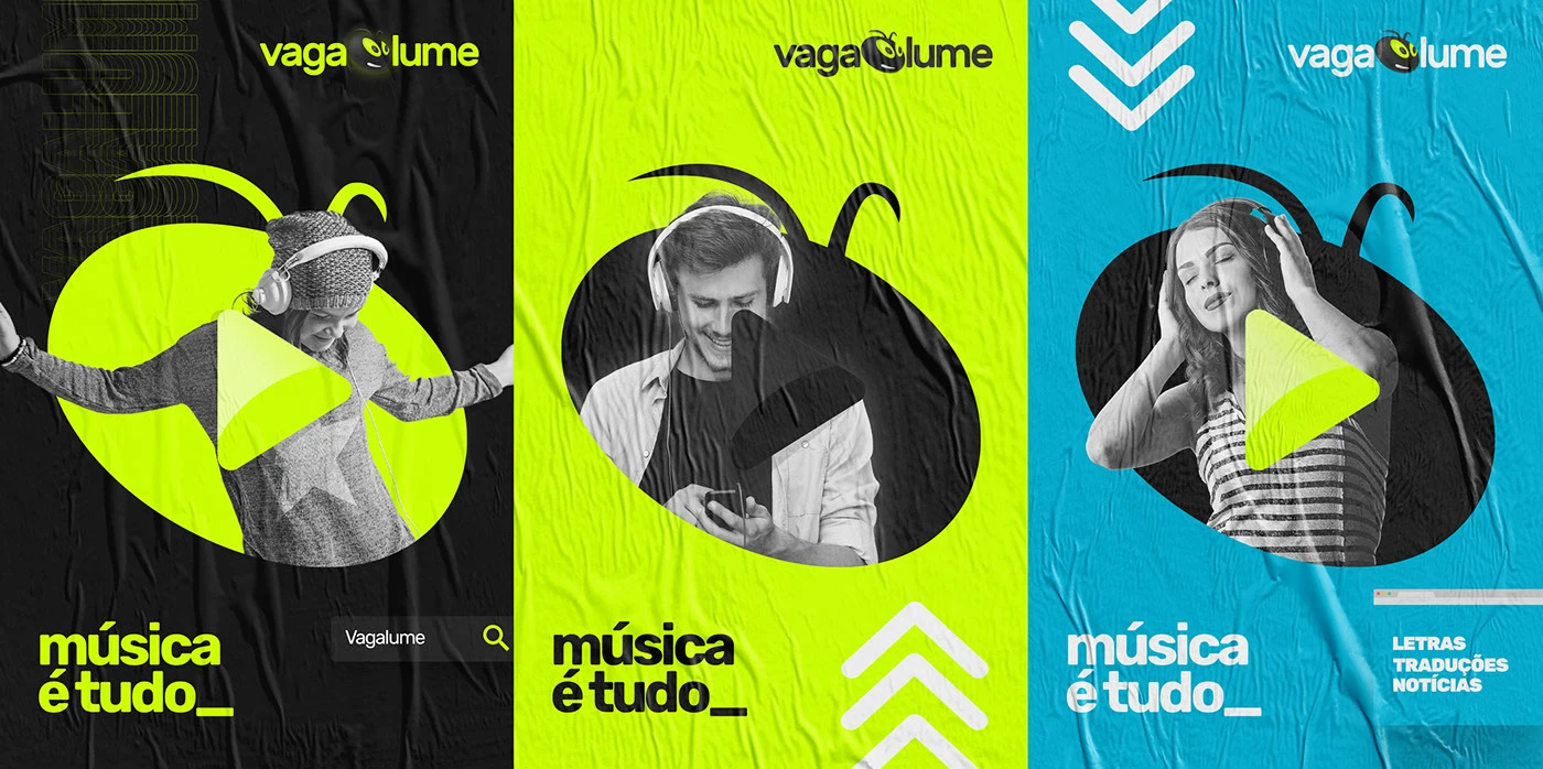
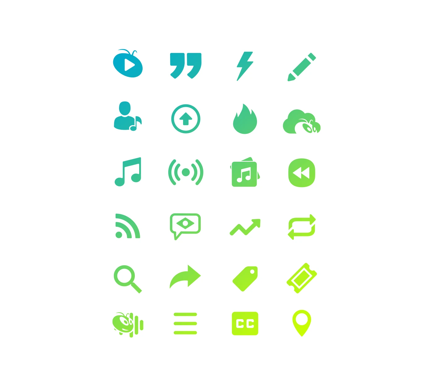
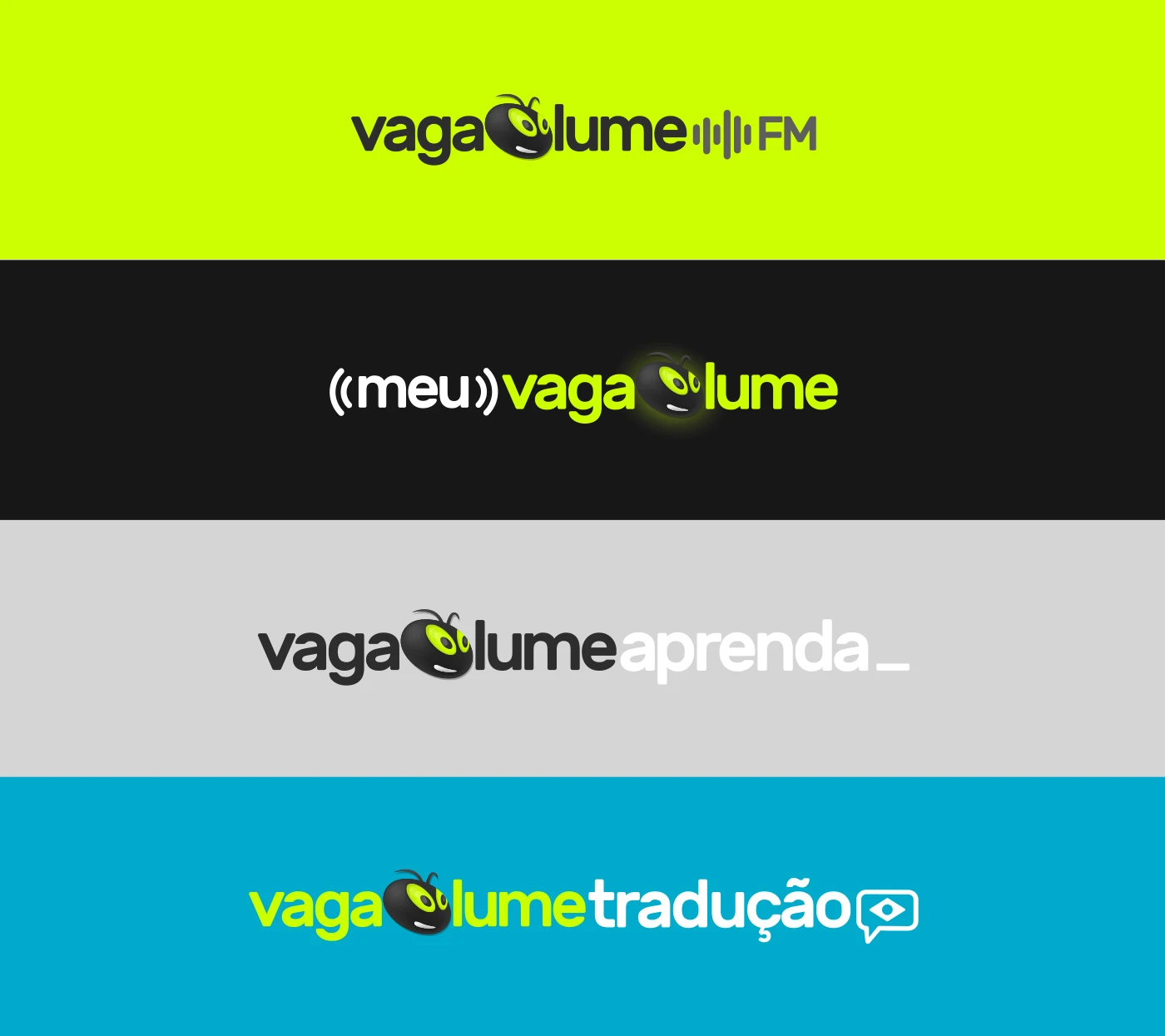
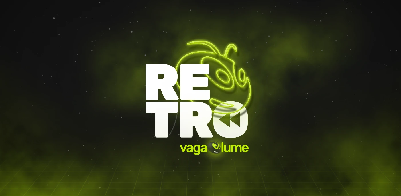
A full visual identity overhaul for one of Brazil's most beloved music lyrics portals — new mark, type system, patterns, and UI language.
Role
Lead Designer
Year
2016
Team
16+ people
Country
Brazil
01
Overview
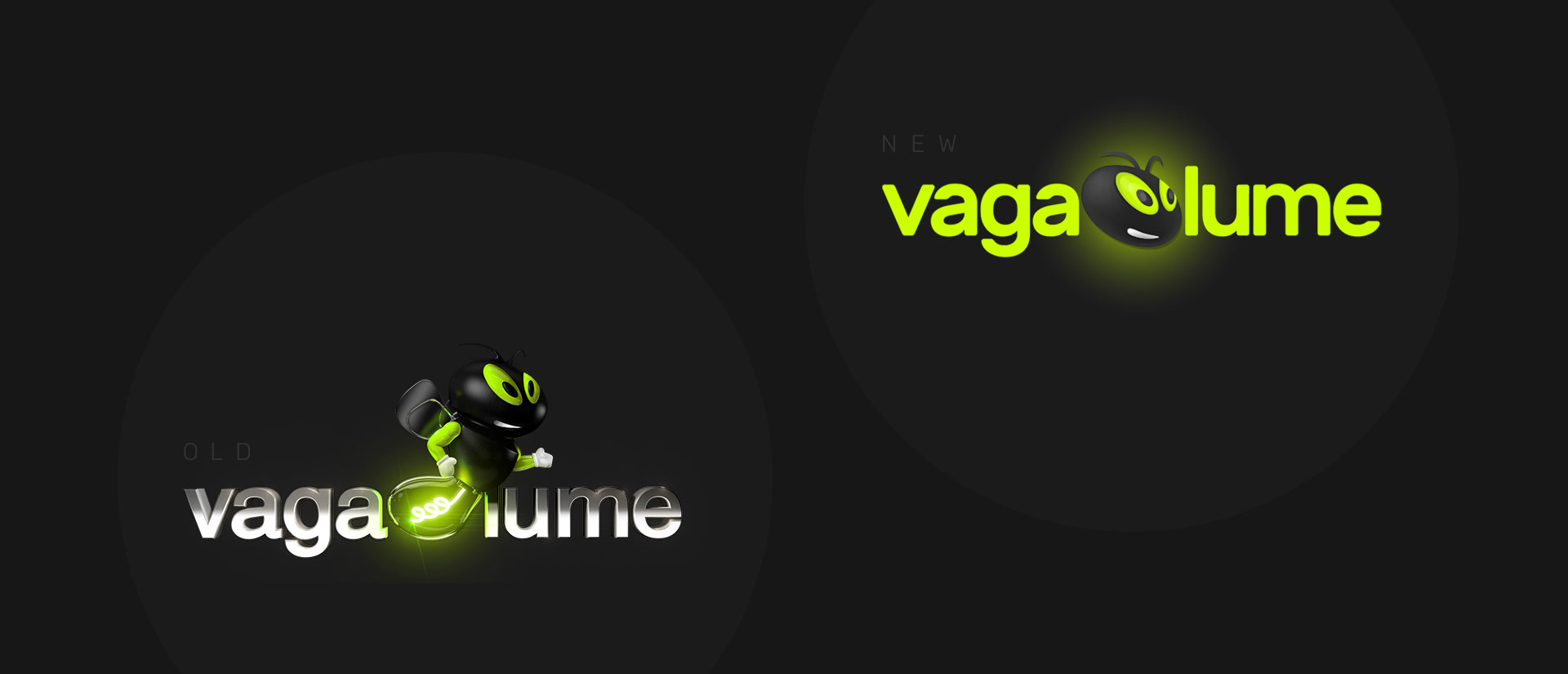
Vagalume has been the go-to destination for Brazilian music lyrics since the early 2000s. By mid-2016, the brand felt stuck in a different era — a legacy mark, no type system, patterns that clashed across every surface. The invitation was simple: modernise it without erasing it. The result is a cleaner, more confident identity that still feels unmistakably Vagalume.
02
Challenge
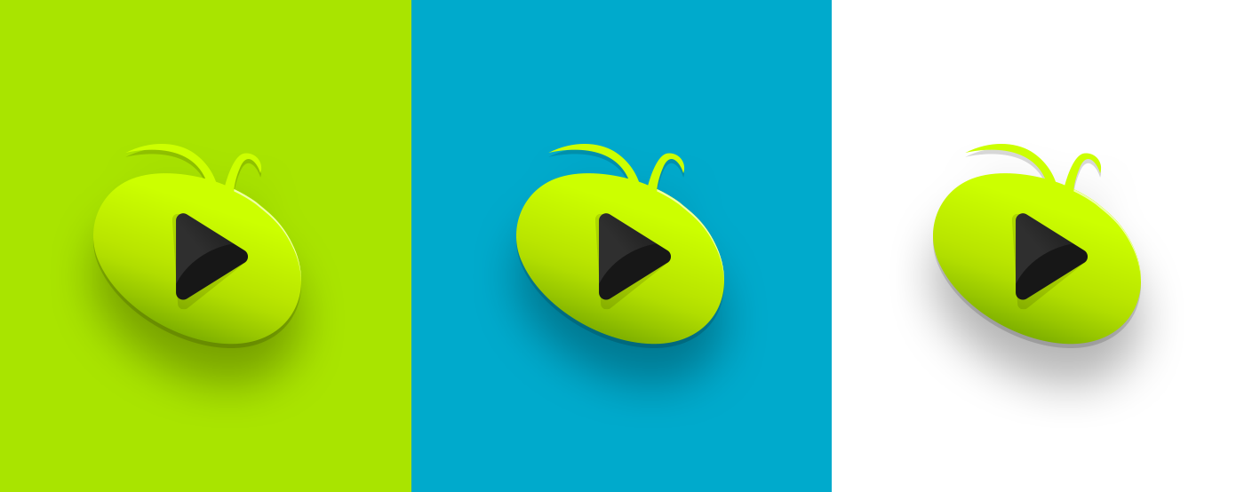
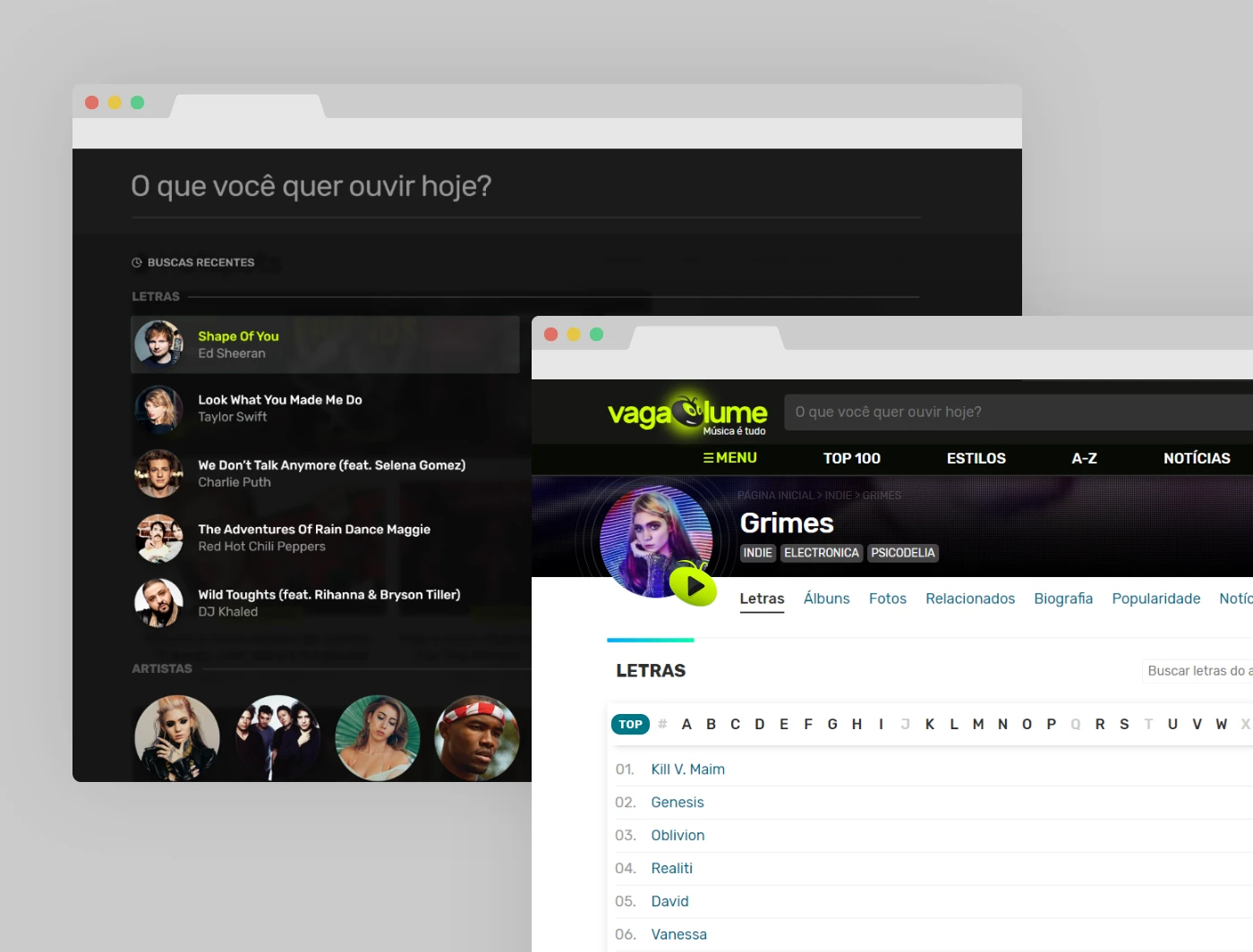
The brand carried real nostalgia weight — millions of Brazilians grew up with it. Any redesign risked alienating the existing audience while also failing to attract a younger one. The mark needed to evolve, not disappear. The colour system needed warmth without loudness. And the new identity had to stretch from a dense lyrics page to social avatars and app icons without losing coherence.
![[ Hero — case study cover ]](/images/vagalume/cover.webp)